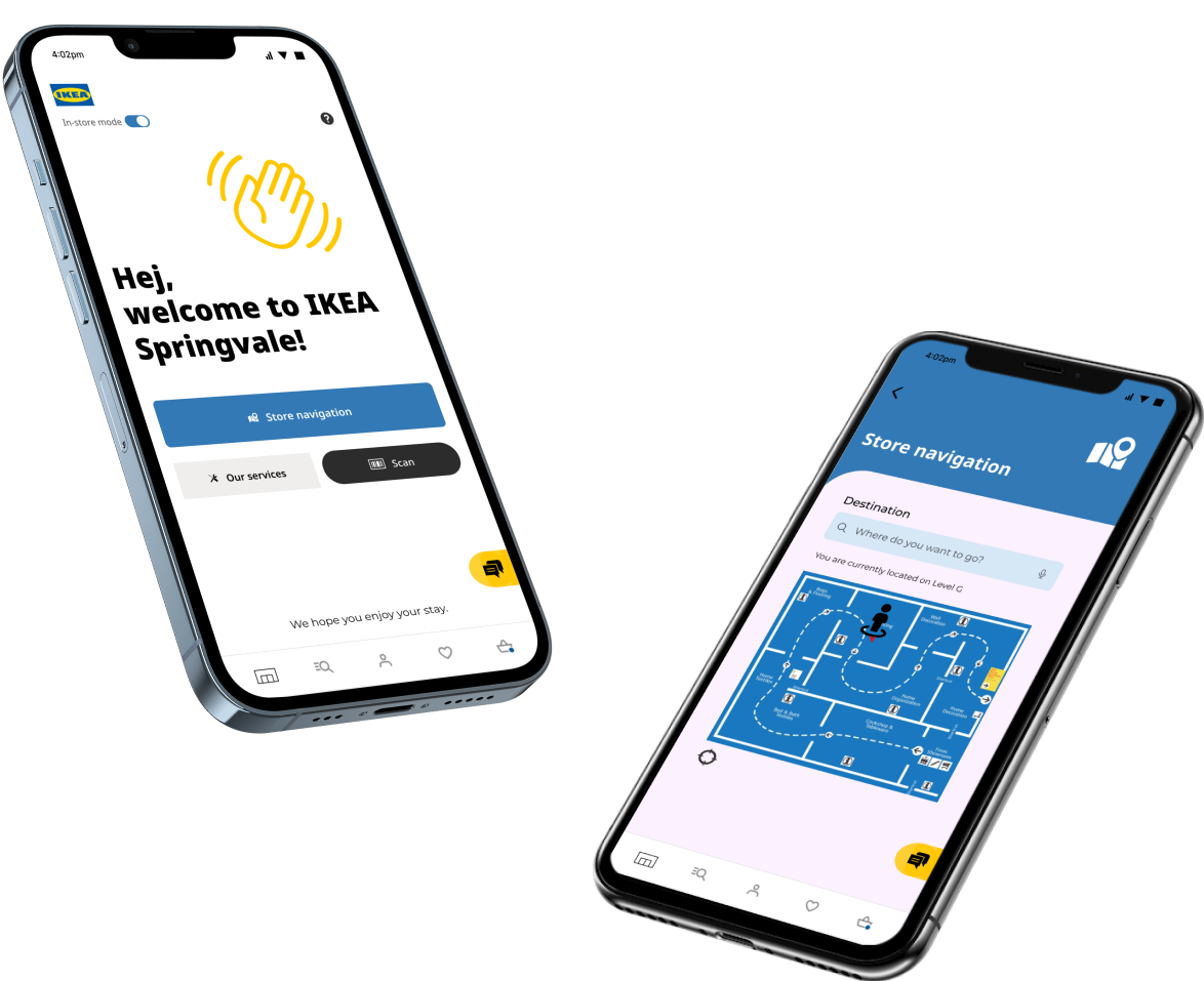
Create a ‘digital touchpoint’ that is aimed to improve the in-store experience of IKEA.
Problem areas include
How might we provide customers with the information they need to more confidently shop at IKEA stores?
How might we provide a smoother returns process for customers?
VALUE PROPOSITION
Allow users to have the necessary tools in the app to shop confidently at IKEA without minimal need of a worker’s assistance. To help boost the confidence of customers, we must fix the user needs found in the research and incorporate solutions into the existing IKEA app.
The features include
Information on P-tags ( product information )
Floor maps
Further assistance
Information on the returns policy
How to find products
Information on the in-store restaurant
Click and collect?
APPROACH
As the research aspect of the project was already done, it was clear to us what the user requirements were for the project. So we were only responsible for the Design phase.
DESIGN
EXPLORATION / SKETCH SPRINTS
I began the Design process by doing 3 minute sprints of sketching ideas. This has helped me explore different scenarios and solutions in a a quick and simple way.
WIREFRAMES
-
The idea I am trying to explore is that the existing IKEA app will and can be activated when a customer enters an IKEA store. Instructions on how to navigate to specific items are out-of-scope on this project, so I will only be designing how to locate the main ‘areas’ of IKEA such as lighting, tables etc. That way it will provide users more confidence in navigating around the store.
NAVIGATION
EXPRESS RETURNS
-
Customers can complete the returns process first before heading into an IKEA store for a smoother return. The express returns already exists on the website, however I will be designing a more easier and intuitive version on the app. I also want to promote the idea of having an express lane for users who have done it through the app so they can easily skip the queue. Which also means more efficiency for both the customers and IKEA workers.
FURTHER ASSISTANCE
-
The idea is that customers can find the information on services through the app, in the form of FAQs. If the customer still can’t find the information that they need, we can connect them to a staff. The services page can be expanded for ‘information on in-store restaurant’, but due to the constraint of time, I am only working on ‘further assistance’.
I believed that the current IKEA app already has a great design system that helps users find
Information on P-tags
Click and collect information
I won’t be changing any of these. I wanted to explore an in-store mode to help users better utilise these additional tools instead within the existing IKEA app.
ITERATION 1
To observe participants experience with prototype and analyse areas that need improvement. Then I can iteratively build based on data discovered.
4 participants that fit the IKEA target audience criteria were involved in each round of testing.
Main feedback
Decrease information load on several screens.
Selecting the “Reasons for returning items” was unclear for some participants.
Minimise steps towards IKEA Assistant Portal.
Main feedback
Make buttons more clear of its intensions. For example the Navigate button. “Navigate to what?”.
Use dividers to seperate sections to make things easier to see for users.
FINAL SOLUTION
AN IN-STORE EXPERIENCE WITHIN THE IKEA APP.
I CAN GET HELP WITH A CLICK OF A BUTTON.
I CAN FAST TRACK MY RETURNS PROCESS.
I WON’T GET LOST ANYMORE!
OBJECTIVE
I CAN FIND PRODUCT INFORMATION WITH EASE.
AS A CUSTOMER…
FURTHER RECOMMENDATIONS
Item assembly videos for complex items.
Customer feedback mechanism to keep improving the app to be the best it can be.
Onboarding process for new customers to help them familiarise how to shop at IKEA
Inspiration page of how customers styled products to improve customer confidence that they can do it too
Over the span of 7 weeks, I completed the entire design process, from ideation → designing → prototyping. I then presented by project to Giovanni Rutligliano, the Head of Digital Design at IKEA Australia.
The 7 weeks was a difficult but fun challenge where I improved on my UI skills. However, I believe that the most important experience I got out of this project was learning to design and cater for a big company like IKEA.
Due to the scale of IKEA, that there was such a wide range of things to consider from the services they offer, to how they communicate to their customers. I had to study IKEA in a deeper level in order to design effectively.
TO IMPROVE ON…
Developing my Figma skills to improve efficiency in the workspace, especially with master components and styles.
Not spending too much time on selecting the perfect font and colour! Time is limited so spend effort on more important things.
Having a more efficient plan on how to tackle bigger companies. Too much time was wasted on wanting to re-design everything.
Improve wireframe drawings so they are more clear and easy to read.
OVERVIEW
PROJECT DURATION
7 weeks
MY ROLE
UX/UI Designer
TUTOR
Sam Hamcock


